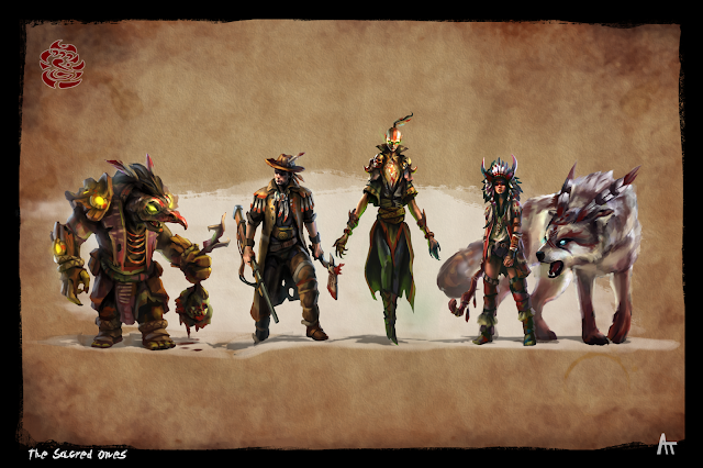
After 4 weeks, I'm finally finished with my character design final! I'm mostly happy with how they turned out. The main criticisms I got on the final day were that, for a game, my shadow areas were going a little too dark and isn't showing enough information to show to a 3D modeler, the background was too low contrast, and Dezba seemed a little too Asian-looking.
The background I pulled back intentionally because Bobby said it started eeking into the realm of splash art and distracted from the overall design of the character. I feel this one is more of a subjective thing. Personally, I would've upped the contrast in the background but for a project focused on design, I think toning down a bit was a good idea and made the silhouettes read much more distinctly.
Since I was aiming for a game concept with these, the shadow crit is pretty understandable. The larger shadow shapes I'm using is much more illustrative and doesn't work as well in a game environment. Although to be fair, I was taught by another instructor to simplify and blend my shadow shapes together which I really enjoy doing! I'm definitely going to add a lot more color into my shadows in the future though.


No comments:
Post a Comment